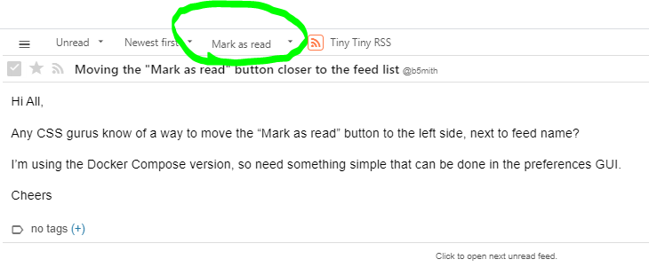
Hi All,
Any CSS gurus know of a way to move the “Mark as read” button to the left side, next to feed name?
I’m using the Docker Compose version, so need something simple that can be done in the preferences GUI.
Cheers
Hi All,
Any CSS gurus know of a way to move the “Mark as read” button to the left side, next to feed name?
I’m using the Docker Compose version, so need something simple that can be done in the preferences GUI.
Cheers
There is a way to reverse the dojo dijit toolbar, itself:
body.ttrss_main #toolbar-frame #toolbar {
flex-direction: row-reverse;
}
That’s perfect, jklm.
Thanks!